
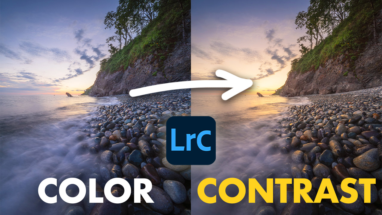
It’s no secret that our eyes are drawn to contrast. The more contrast a photo has, the more interesting it tends to be. But “contrast” isn’t just the slider in Lightroom, it can come in many different forms.
- Tonal Contrast / light and shadow
- Texture Contrast / rough against smooth
- Directional Contrast / lines and movement pulling against each other
- Color Contrast / the subject of this post
Complementary / Contrasting Colors


Fundamentally, color contrast in editing comes down to complementary colors, or colors that sit on opposite ends of the color wheel.

In landscape photography specifically, the most common pairing you’ll find is orange and blue, but when you begin looking for it, you’ll be able to find contrasting colors all over.
Why Does Color Contrast Matter?
When color contrast is done well, it does three things for a photograph:
- Creates separation between your subject and its background.
- Adds depth, helping flat scenes feel more three-dimensional.
- Creates visual interest, keeping the viewer’s eye on your image longer and emphasizing a focal point.


Brands like FedEx and IKEA use contrasting colors in their logos for this reason, it sticks with you. Even the Simpsons’ iconic yellow skin tone traces back to color theory, contrasting colors and trying to create something eye catching.

The exact same principles that make Homer stick in your mind can be used deliberately in your landscape photography while in the field as well as editing in Lightroom or Photoshop.
Creating Color Contrast With Luminosity Masks

One of the easiest and most effective ways to create color contrast is by adjusting the white balance within a luminosity mask. Usually this means cooling down the shadows or bringing warmth to the highlights, but you can adjust these however fits the image.
In the image below, I felt the colors of the whole photo was too warm. By targeting the shadows and cooling them down, I feel it balances the image.


Desaturate the Excess
Frequently an image can have multiple dominant colors. In these instances, you can improve the color contrast by desaturating and adjusting the hues of any “excess” colors in the HSL Panel.


Color Range Masks
Another easy way to create color contrast is by using Color Range masks. This targets a singular color in an image. In this case, I simply inverted a mask selecting yellow, and then adjusted the colors of everything else around it.


Video Tutorials
Enjoy these two videos on creating color contrast in your images.
Leave a Reply